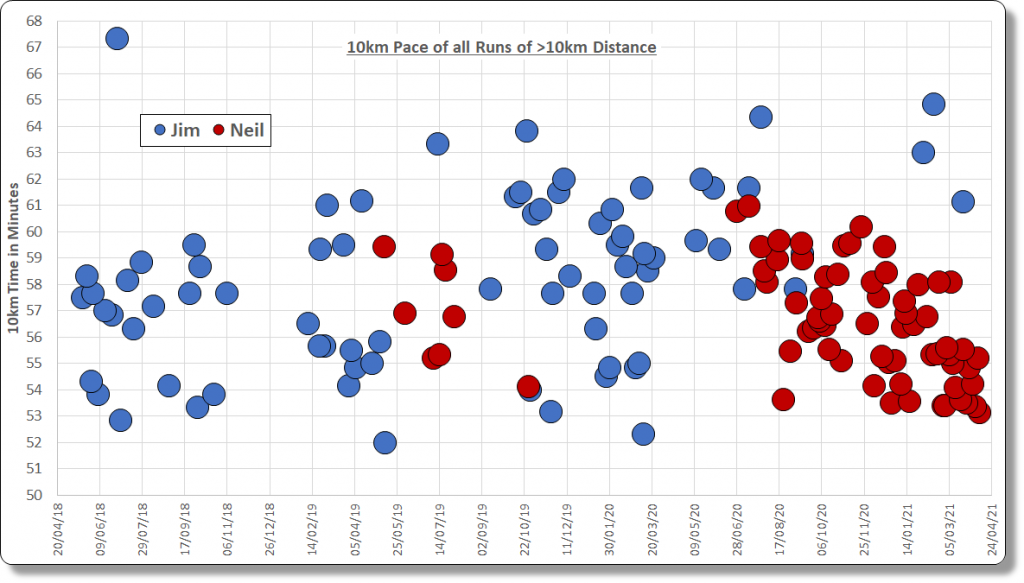
Today I interpolated the 10km pace of all of my recorded runs of longer than 10km and those of my friend and plotted them on the chart below. (Click to view in full size.)

Many of the runs were of far longer than 10km, so working out the average pace does not always allow for direct comparison of runs. There are also runs shown which had very fast 10km segments within them not reflected in the average pace over the course of the full run – e.g. half marathon races with the pace slowing towards the end. Some of the runs are also interval training, or hill training etc.
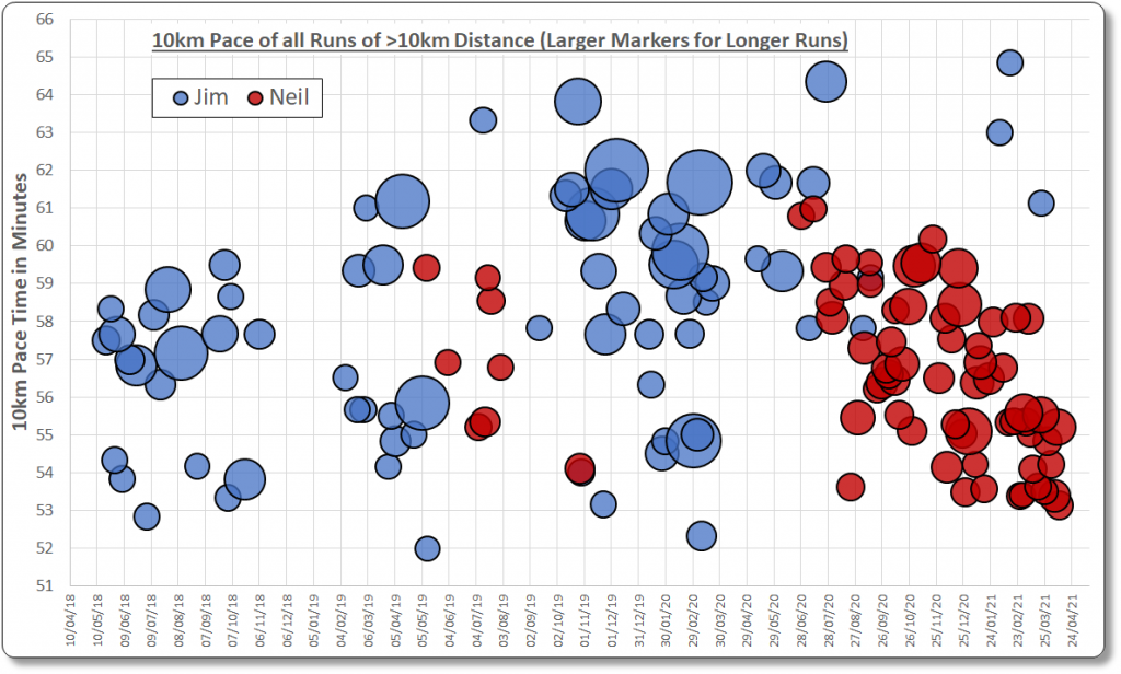
The bubble chart below shows more information than the chart above since the size of the bubble marker for each run now depends on the distance of the run it represents – the larger the bubble, the longer the run.

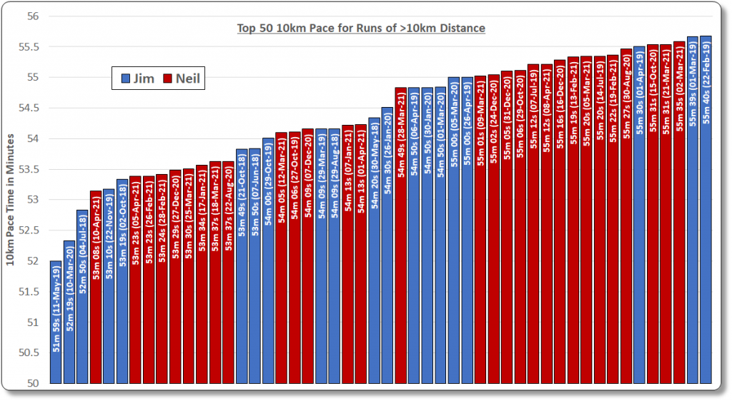
The chart below shows the fastest 50 equivalent 10km paces for all of the 146 runs of over 10km distance. Again, click on the chart to view in full size.
