I have continued experimenting with Microsoft Power BI trying to find situations in which it is faster and easier to use than Excel for data visualisation. If I find something faster and easier in Power BI (in which I have <=0 experience), then it really must be a strong use case for the application.
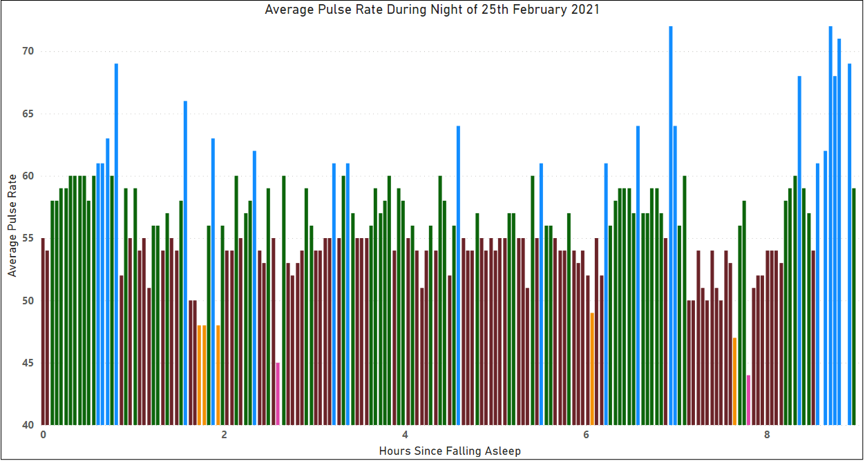
Looking at my heart rate data from yesterday night from my fitness watch in Excel, my goal is to conditionally format the bars in a bar chart so that different ranges of my heart BPM data are presented in different colours.

The way that I typically achieve something like this is shown above.
I import the data, then create bins (in this example: 0 to 0.1 hours, 0.1 hours to 0.2 hours, 0.2 hours to 0.3 hours..etc of time).
I found the average measured pulse rate for each time bin (using averageifs), and then added a series of columns to bin the average pulse rates – e.g. the column headed ’50’ will display the average pulse rate 54.5 if the value is 50 or more and less than 55.
Each of these columns of binned average pulse rate data can then be plotted in a bar chart as a collection of series (y-axis) against the binned time values (x-axis).
This resulted in the chart pictured below. It uses the default colour scheme chosen by Excel, but you can modify the colour of each series individually if you want to highlight a specific feature in the data.

The whole process did not take too long…probably five minutes, but there are many opportunities to mess things up, particularly with the absolute, mixed, and relative cell references while building up the table of data to display on the chart.

Within Power BI, the generation of a similar chart was fast, with less potential for errors to slip in. Setting and prioritising the rules just takes a few clicks on the Data Colors pop-up shown above, which resulted in the chart shown below.
I’d like more control of the tick marks on the axes and their labels than I have managed to find thus far, and also the ability to easily change the number of bins per unit that the data is averaged over – e.g. to set 6 bars per hour, or 10 bars per hour, or whatever makes the date the clearest.
However, it was certainly a lot easier technically to generate the chart with Power BI than it was to generate an equivalent chart with Excel.