Looking at the data from Johns Hopkins (https://data.humdata.org/) to see how various countries are doing at the moment with regards to their respective fights against the Coronavirus pandemic.
The chart below shows the percentage increase in deaths due to Covid-19 for last week compared to the reports from the week before for countries with >500 deaths in the last 7 days. Things are not looking good for a collection of Central/Eastern-European nations.

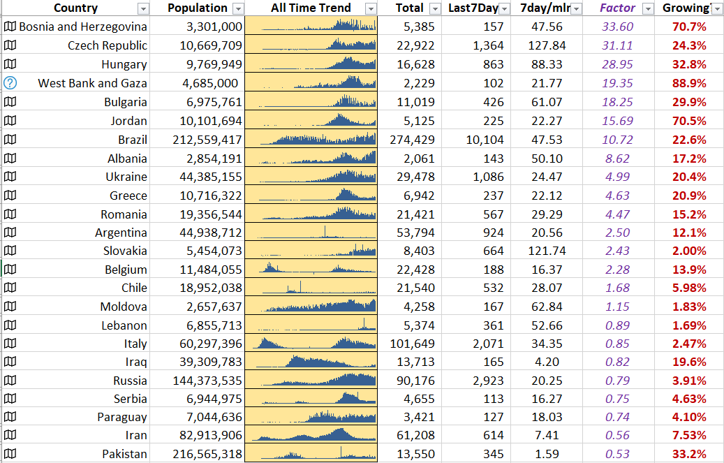
Sorting now by the number of deaths per million of population during the last 7 days for countries with >100 recorded deaths in the last 7 days it is shown that Central/Eastern-Europe is doing very badly, and Bosnia, Jordan, and Palestine have very high rates of growth of reported Covid-19 deaths. (In those countries, cases are still rising to, so things are going to get much worse for them before they get better.)

Multiplying the week on week growth rate of reported deaths per million by the number of deaths per million reported in the last 7 days, and then sorting on that value (shown in purple), we get an (not necessarily scientific) estimate of which countries are suffering the most at the moment:
Finally, putting the above table of data into Power BI, we can visualise the main problem region as of 7th March. The blue circles’ sizes show the current seriousness of the problem in that particular country.

Zooming out to show all of the countries in the list:
