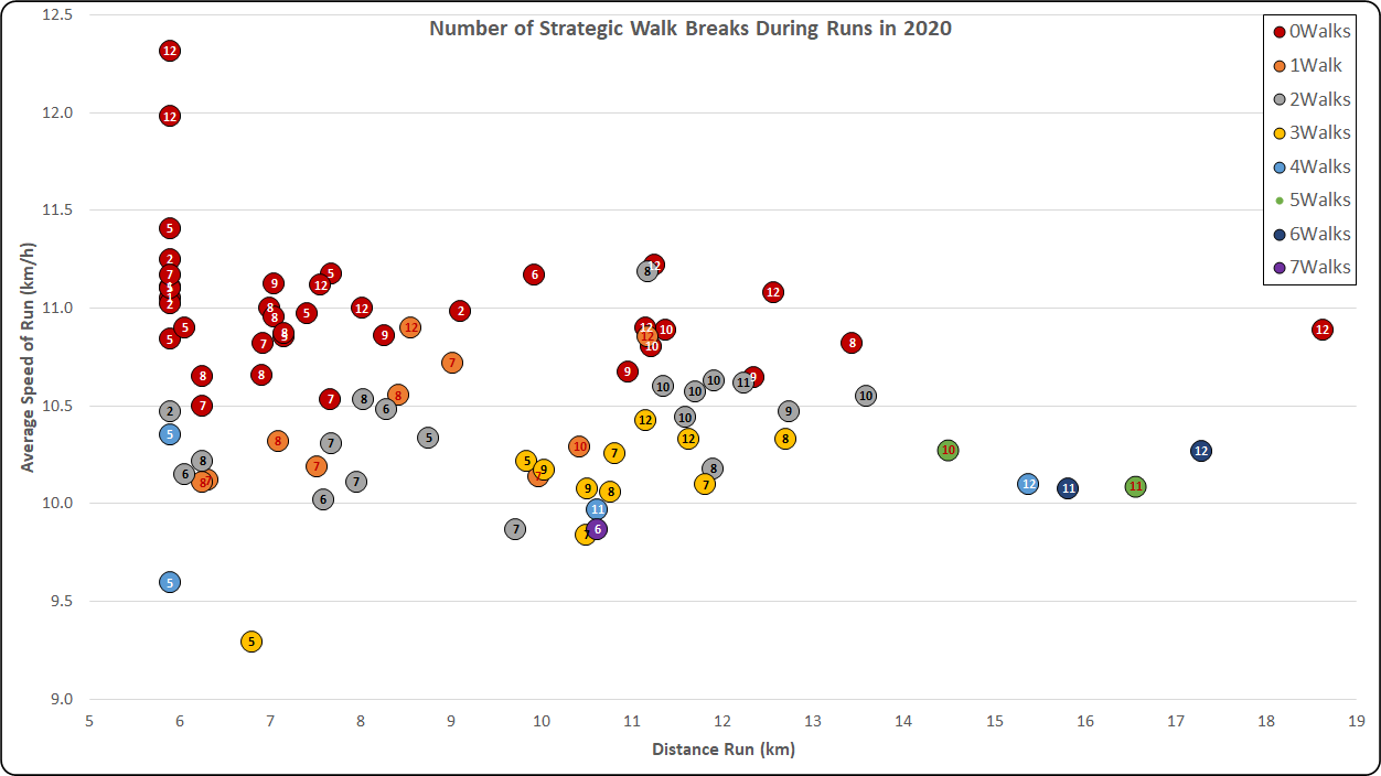
Getting back into running in 2020 after a slow start to the year and then the first Covid-19 lockdown resulted in some tactical walks being required during runs – particularly as the runs increased in length.
The chart below, plotted in Excel, shows the distance and average speed of each of my runs of 2020. Each data point is labelled with the month number when it took place: Jan=1, May=5 etc.
Conditional formatting is used to show the number of walk breaks for each run using colour – red for no walks, orange for 1 walk, etc, as shown by the legend at the top right of the chart.
Click on the image below to view in full resolution.
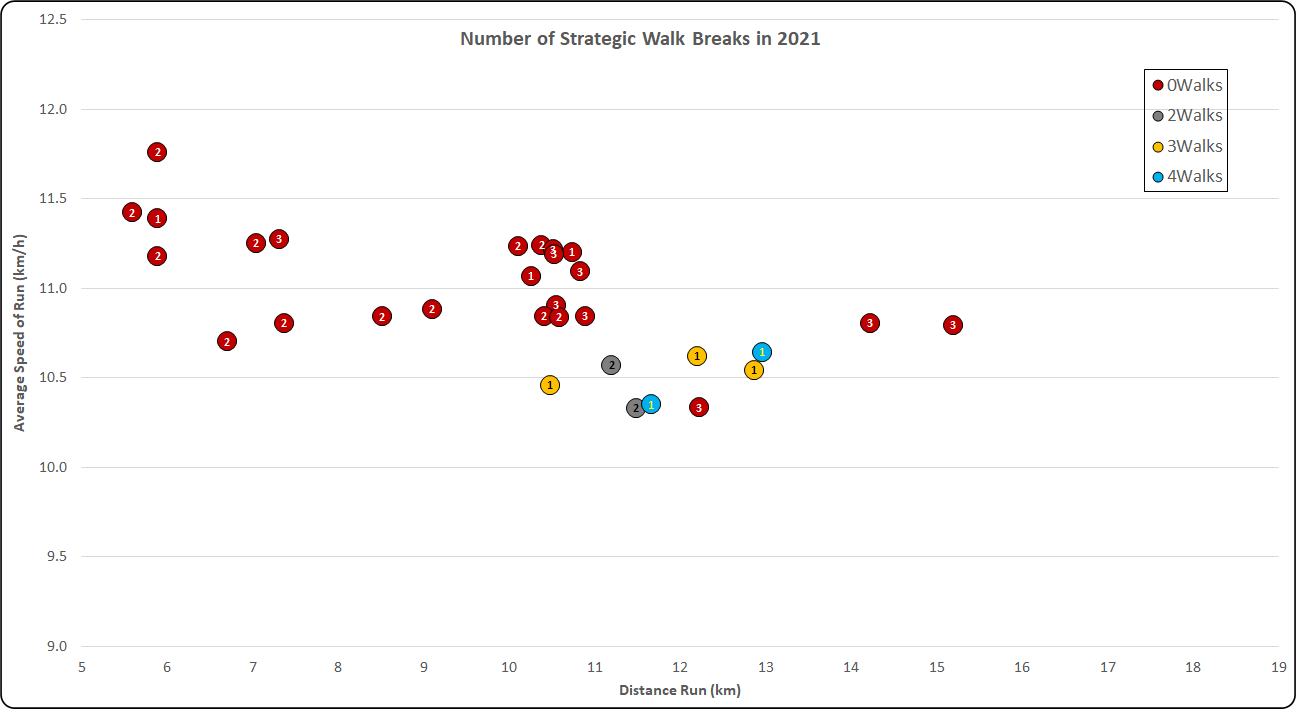
Looking in the same way at my running data from 2021, things are looking much more consistent than in 2020 with far fewer walk breaks and faster average running speeds too. Again, click to zoom in; data points are labelled with the month numbers 1, 2, or 3 corresponding to the first three months of 2021.