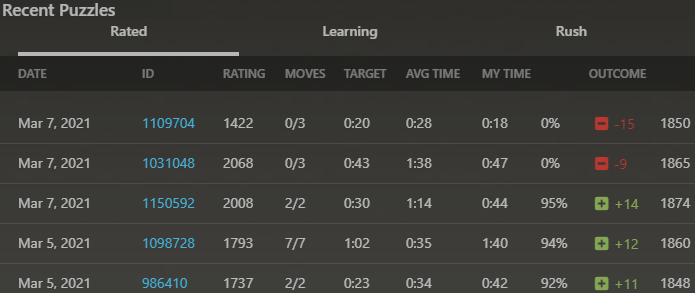
Chess.com offers puzzles to help people to improve their chess playing skills. The stats relating to the last 25 puzzles completed by any user of the website can be see online here: https://www.chess.com/stats/puzzles/PLAYERUSERNAME , as shown below.
I copied a table of this data, dropped it into an Excel worksheet, and added an index column numbered 0-25 to label each puzzle attempt. I then imported that worksheet into Power BI to see how I could visualise it.
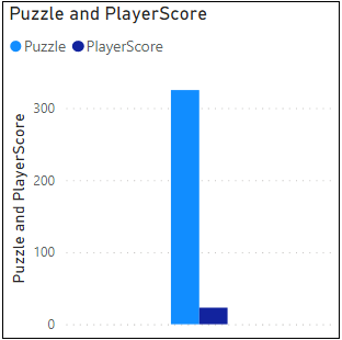
I attempted to plot a bar chart showing the number of the puzzle on the x-axis and the score the player received on the y-axis, but I kept getting charts like the above*. I could sum or average or count the number of puzzle numbers (0-25), but I could not get Power BI to use them as labels on the axis.
* Later when I saved the same data from Excel as a CSV file and imported that into Power BI, this problem was not present.
I figured that perhaps I had to convert the numerical values of the puzzle numbers to text, so that Power BI would not insist on performing mathematical operations on them.
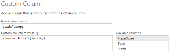
To get around this issue (which hopefully is a lack of knowledge by me issue), I created a custom column containing the text equivalent of the puzzle numbers as shown above.
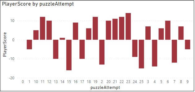
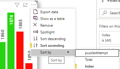
This turned out to work, but, when sorting on the new puzzleAttempt number, the sorting is carried out alphabetically instead of numerically resulting in an incorrectly sorted chart.
I then added a further column to the data, a Power BI Index column. Then I struggled for a bit to find out how to plot puzzleAttempt vs playerScore, sorting on the new index but without displaying the new index values anywhere on the chart.
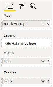
It turned out that to achieve that, I simply had to drag Index into the Tooltips box, and then it became possible to sort on that field.
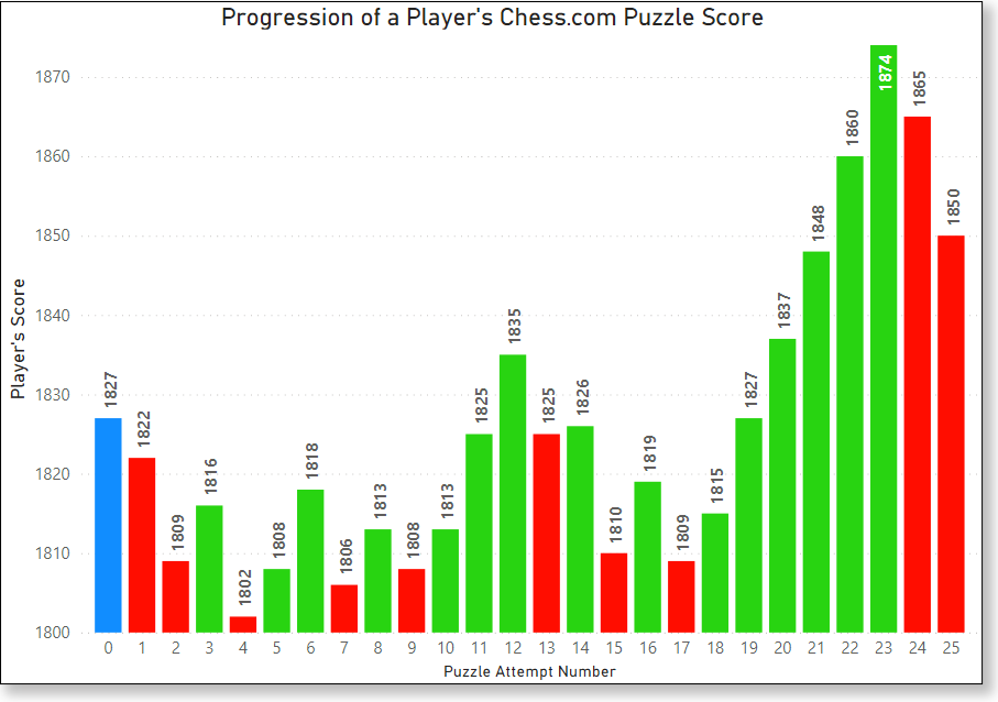
With everything now in place, I came up with charts such as the one pictured below. The red bars show puzzles answered incorrectly, and the green show the correctly answered puzzles. The blue bar shows the score before the 25 puzzles were started.
I used the Data Colors rules shown below to set the colours.
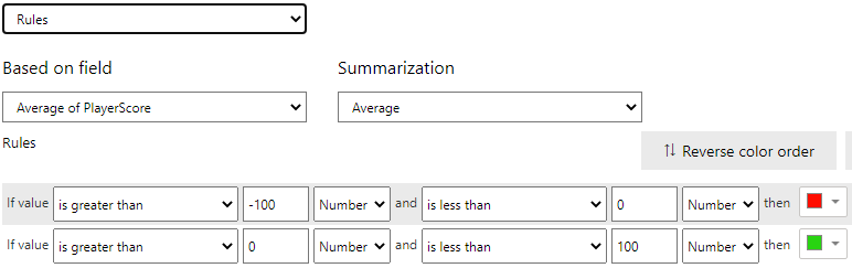
…but I could find no way to set rules based on multiple fields on the same chart, for example, to also set the bar colour to black if the Index equals 0. I also found no way to change the number format of the y-axis labels to x,xxx format for example.
It would also have been nice if I could have followed each data label with the score the player received for that puzzle – e.g. 1802 (-15), but I could not find a way to do that.
If I could label with the contents of another field instead of only with the field depicted by the bar, I could simply add a custom column with my desired label format, and use that field to label the bars of the charts, but is it possible?