Below is a CSV file containing data on the number of positive Covid-19 tests reported in the UK per day since the start of the pandemic (downloaded from https://coronavirus.data.gov.uk/)

The chart below uses this data to show the number of reported Covid cases only on Tuesdays throughout the pandemic.
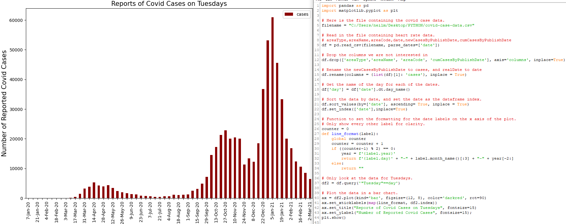
This required a lot of learning about datetime object manipulation in Python and pandas, filtering data from dataframes that meets particular conditions, and labelling the axes of plots with different text formats and conditions…such as in the chart above, only displaying every other tick label on the date axis for clarity.

For the above chart showing the 7-day rolling average of reported daily Covid cases in the UK, a little more processing was required of the data, and the x axis labels modified to just show the first day of each calendar month.
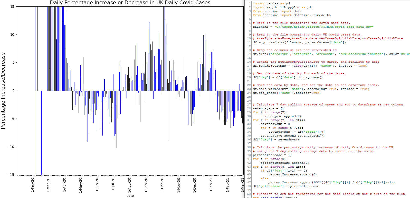
And, for the chart below, this 7-day rolling average data is used to show the daily increase or decrease of reported daily Covid cases in the UK.