From my fitness watch I have collected my heart pulse rate data from 15th October 2020 to 2nd March 2021 inclusive for a total of 43,318 readings.

I have already processed this data many ways with Excel – for example, below, I look at my heart rate for the first 7 hours of the night (average for each hour, minimum, maximum, and 7 hour average).
At the bottom of the table are total heart beats in first 7 hours of the night, and for every Sunday there is the average number of total heart beats per day for the preceding week.

I’d like to replicate and then extend the analysis of my heart rate data using Python. Currently I have to pre-process the data from the watch using PHP and then Excel reads in the outputted CSV data. Eventually I’ll use Python to do all of the pre-processing, processing, table generation, and visualisations.
Every journey starts with a single step. Here is a Python plot of my average heart rate over the last 4.5 months.

* Getting labels to show for each of the bars of the bar chart AND to have them nicely centred required online copy and pasting. Thank you to:
https://stackoverflow.com/questions/25447700/annotate-bars-with-values-on-pandas-bar-plots

Above are my average pulse rates for each hour of the day over the 4.5 months of data collection.

Apparently I need to extract the desired data from the DataFrame containing all the heart rate CSV data, put it into a list, and then convert that list into a new DataFrame before plotting it.
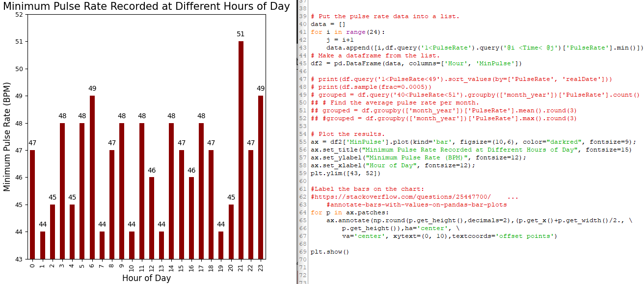
Below are my lowest recorded pulse rates for each hour of the day over the last 4.5 months.
The query had to be modified to remove values <1 as a few times the watch erroneously detected a pulse rate of 0 which is not the true minimum.