I have used Python on and off ever since the Raspberry Pi was first released back in 2012 for renewable energy related projects: http://www.reuk.co.uk/wordpress/raspberry-pi/, but I always took any data output and processed it with PHP and/or visualised it with Excel.
However, there are many modules which can be imported into Python which make it possible to collect, process, and visualise data. NumPy with Matplotlib provides powerful, extensive, and very flexible tools for all data visualisations. Python is already excellent for data processing, even better with NumPy, and then when coupled with pandas for data importing and manipulation, is perfect for many applications.
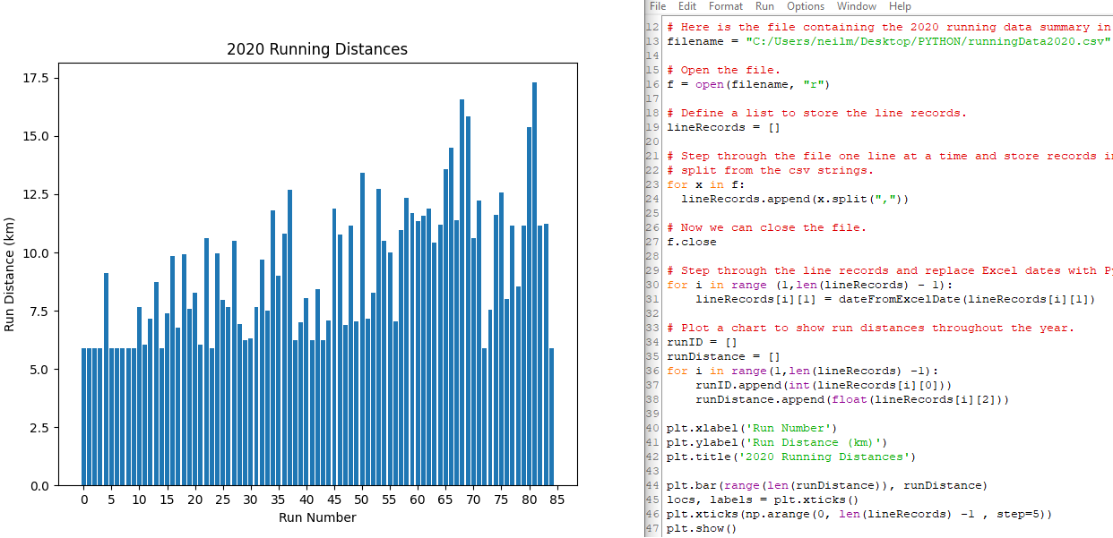
To get started and to ensure I had everything installed and set up properly, I got the CSV file of my 2020 runs, and drew a few basic plots.
The plot below shows distances run over the course of the year in order.
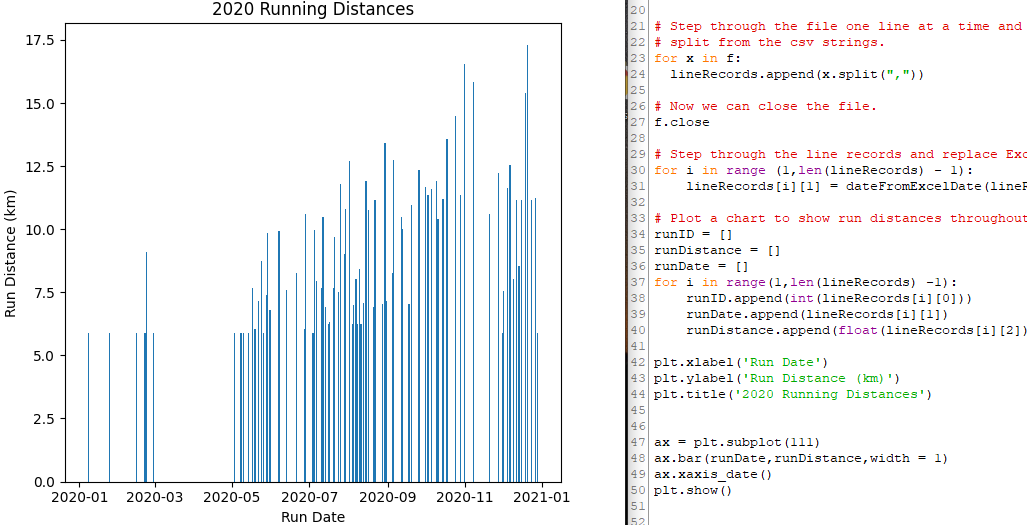
The next plot shows the calendar date of each run with its distance up the y-axis.
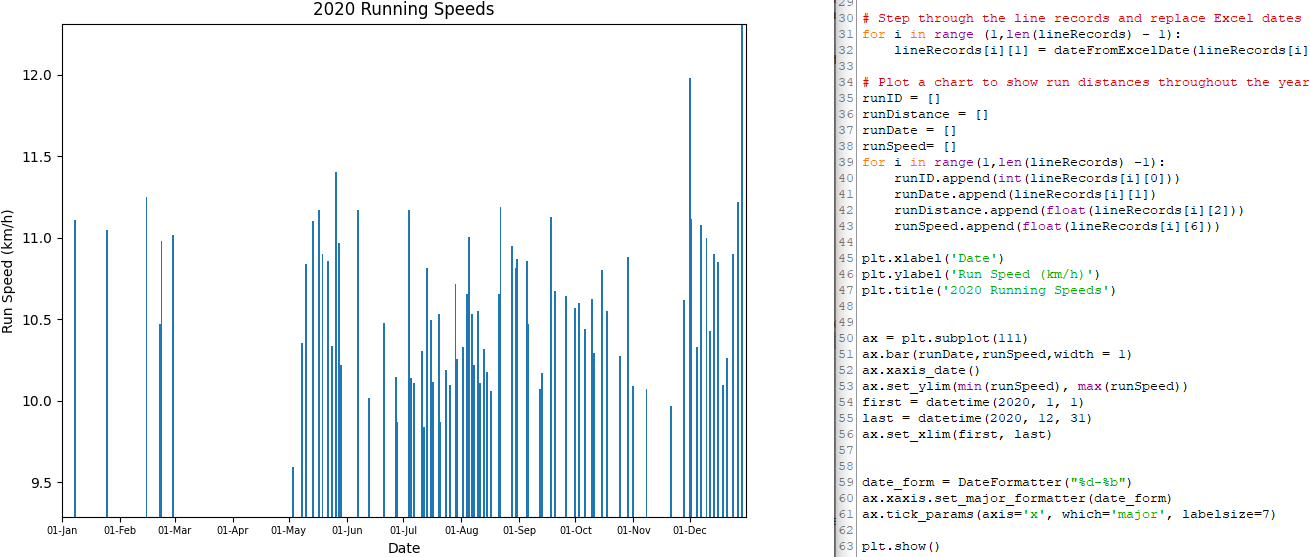
And the next plot shows the speed of the runs…this time with the axis labels and ranges defined to better show the information from the data.
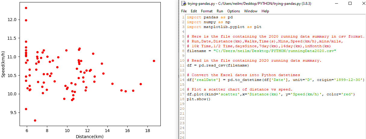
Moving on to pandas to make reading in and processing the CSV file much easier, here is a scatter chart of distance vs speed for all 2020 runs.
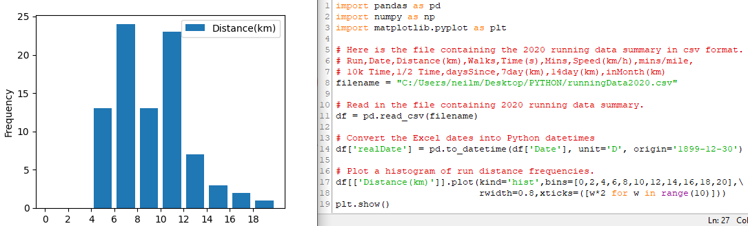
and, here is a histogram of distances run over the year.