Our World in Data have a comprehensive Coronavirus Pandemic downloadable dataset available in Excel, CSV, and JSON formats. I read the
Our World in Data have a comprehensive downloadable Coronavirus Pandemic dataset available in Excel, CSV, and JSON formats. I imported the CSV datafile directly from the web into Power BI, pre-processed the data a little with Power Query, and used it to make an interactive dashboard.
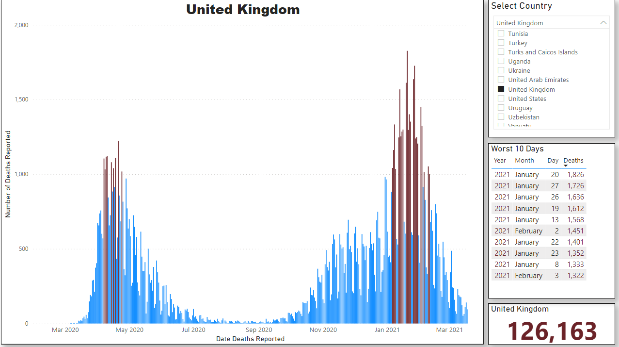
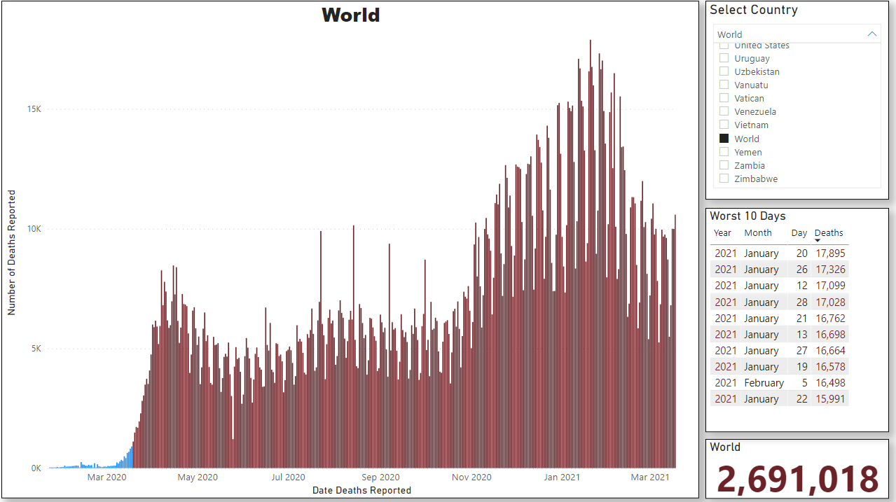
The reported deaths per day are shown in the large chart, with days exceeding 1,000 deaths coloured red. Top right is the slicer which enables the data from any of the countries in the dataset to be visualised. Below that is a sorted list of the 10 days with the highest reported deaths. Finally, in the bottom right is displayed the total deaths for the country.
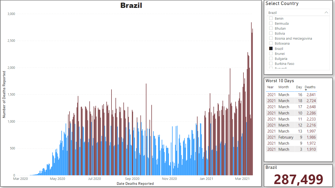
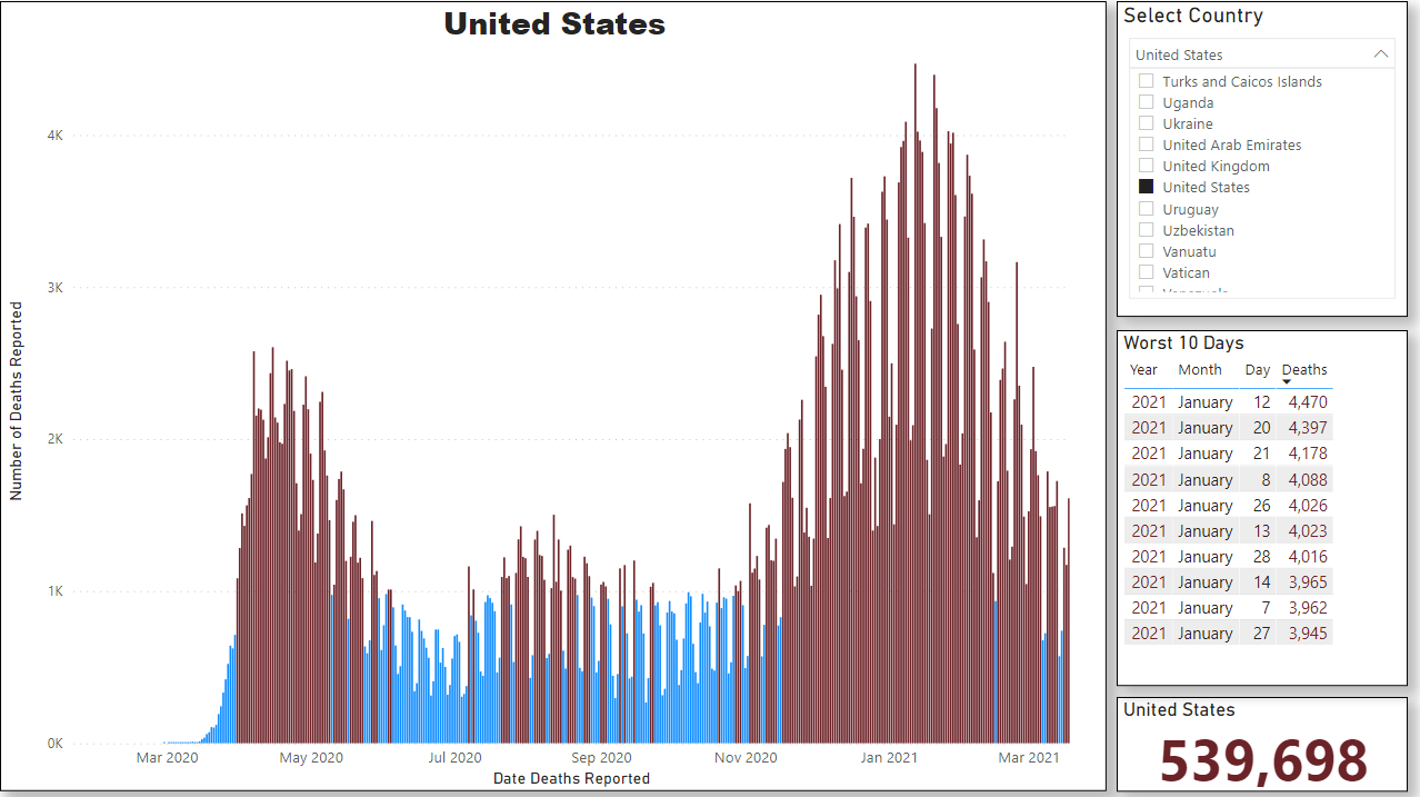
The data set also has grouped data for the various continents – e.g. Europe, South America – and also for the world.
For this type of dashboard visualisation application, Power BI is very good and relatively quick and simple to use. However, if the data requires a lot of pre-processing, or if you want to generate additional columns and tables from the data, it seems to be faster to do all that in Excel first and then import the Excel worksheet into Power BI. Alternatively, become an expert using Power Query.