Using the Coronavirus Pandemic Dataset, downloadable: https://ourworldindata.org/coronavirus-data from Our World in Data, I looked at how the number of deaths attributed to Coronavirus is changing for various countries. I selected only those countries which have a population in excess of 2 million, and which had already suffered a total of at least 500 deaths per million of population.
The chart imaged below summarises this data. Click on the image to view it at full resolution.
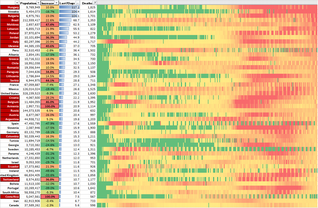
From left to right we have the country name, population size, increase in number of reported Coronavirus deaths in the last 7 days compared to the 7 days before, the number of deaths per million population over the last 7 days, the total deaths per million population during the pandemic, and a heatmap (from March 1st 2020 to 18th March 2021) to visualise the number of reported daily deaths per million population.
Country names highlighted in red are those where the number of deaths increased last week compared to the week before. Hungary for example had 117.1 deaths per million population in the last 7 days and that number was an increase of over 10% compared to the week before. Slovakia had 104.4 deaths per million population, but that number was 16.7% down on the week before. Therefore, the situation in Hungary is bad and getting worse, the situation in Slovakia is not quite so bad and is also getting a bit better.
Countries with a high number of deaths in the last 7 days AND a high percentage increase over the previous week are not moving toward a good situation – Moldova, Jordan, and Ukraine stand out for example as being likely to suffering many more deaths in the coming weeks.
Countries such as UK, Ireland, Israel, Spain, and Portugal are seeing huge drops in their rates of death, and hopefully with their vaccination programmes are heading permanently and speedily in a good direction.
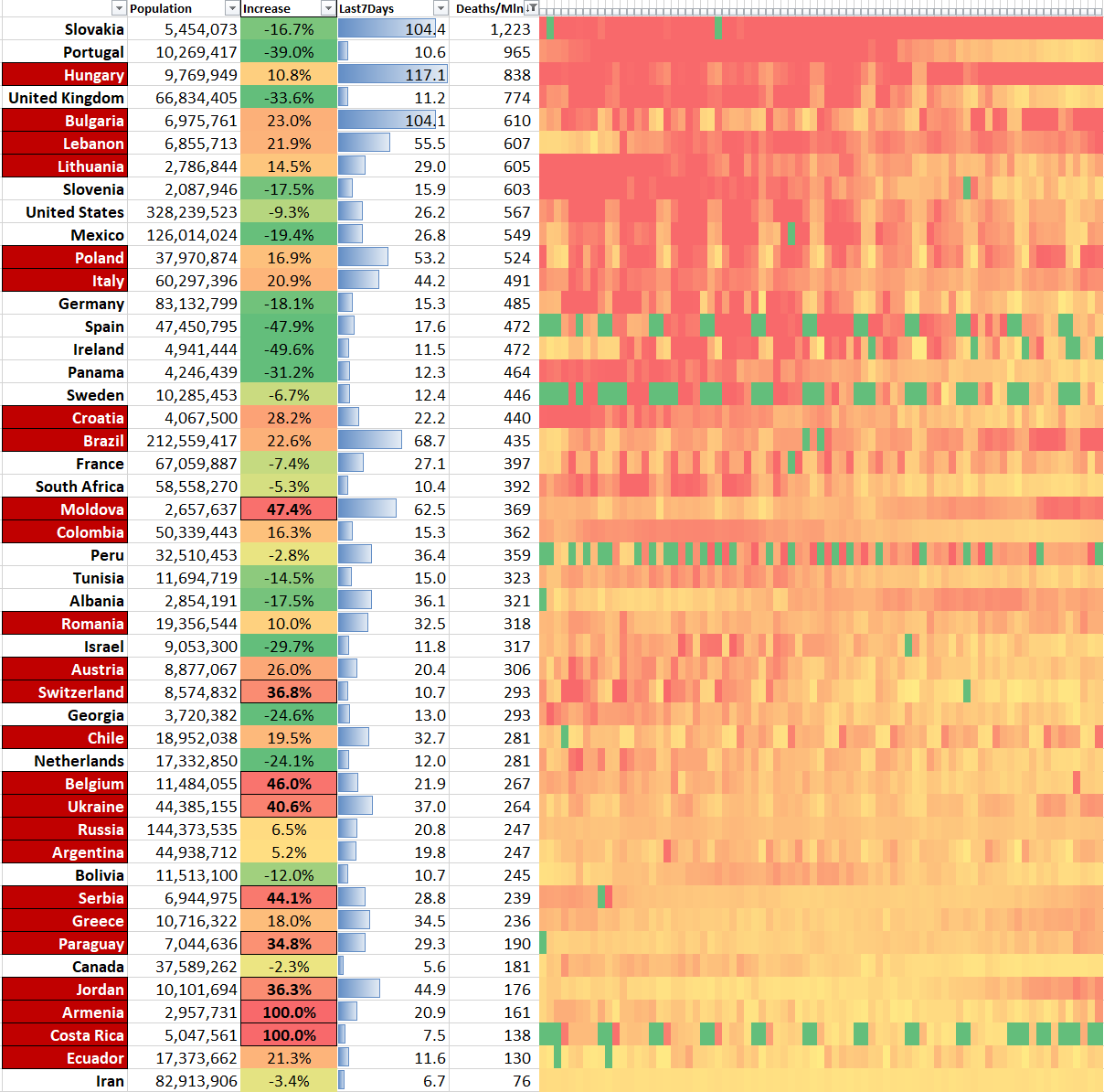
The chart below is sorted on the number of deaths per million population since 1st January 2021 for the same countries as above. The countries which have suffered the most over the last 11 weeks are at the top.
Many of the countries currently experiencing increases in deaths are currently towards the bottom, but will be on their way up the table in coming weeks.
The countries highlighted in red are again those experiencing increases in Covid related deaths, so those countries highlighted and situated towards the top of the table are in a very bad situation right now.
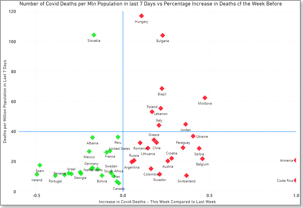
The final charts, below, were generated using the summary data above, but in Power BI instead of Excel.
The countries in red have increasing numbers of Covid deaths, and those in green have decreasing deaths. Those toward to the top right of the chart are in the worst position….high number of deaths per million population and increasing numbers of daily deaths – Hungary, Bulgaria, Brazil, Moldova, Poland, Lebanon, Italy, and Jordan.
As the weeks progress, these countries will either move up and to the right (bad), or move down and to the left (good).
* Click on the image below to view at full resolution.
The countries below are doing well right now, and moving in the right direction: Ireland, Spain, Portugal, UK, and Israel in particular.
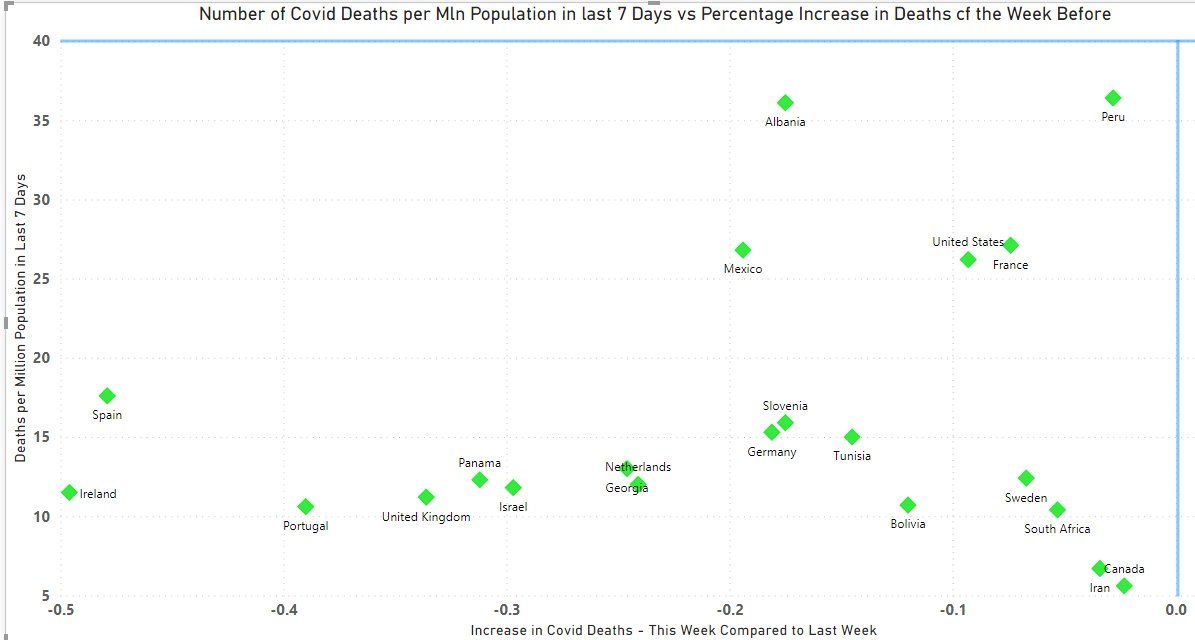
The countries shown below are those which are doing particularly badly right now, and moving in the wrong direction. Things are going to get worse before they get better for these countries.
