I recently used Power BI to visualise some Coronavirus data for different countries, and conditionally formatting the data series markers was very easy and intuitive. I wanted to try something similar with Excel (no VBA) on my running data to visualise the quality of my runs month by month so far through 2021. I found this guide online: Conditional Formatting – Chart Data Labels which provided a lot of information and examples.
Below is a sample of the data I have collected from my runs during 2021. It shows Speed (Km/h), Distance (Km), WMA: explained here: http://www.neilmcniven.co.uk/comparing-the-quality-of-timed-runs-of-different-distances/, and the Date.

From that data I find the name of the month and the day from the date. Then I added the labelled month columns and filled them with the WMA grading of each run which took place during each month or NA() if the run was in a different month. (Use NA() because it is ignored by a chart whereas cells filled with 0 or “” are treated as having value zero and plotted as such.)
I then plotted an X/Y scatter chart with date as the X-axis, and the three month series on the Y-axis. The chart therefore has three independent series on the Y-axis; one for the runs of each month, and these can be formatted independently of each other with different font sizes, labelling rules, colours, and so on. Therefore, the ‘conditional’ part of the chart formatting is done before the chart is created.
Below is an example of one such chart. Click on the image to view in full size.
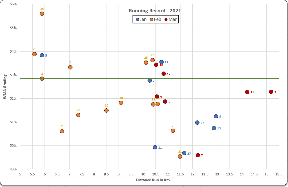
Note that for the above, I also added a series with all values set to be the WMA grading of the 10th best run of the year. I added this series to the chart which gave 10 data markers running horizontally across the chart at 52.84%, formatted these to make them as small as possible, then fitted a linear trend line to that data series to get the Top 10 threshold line as pictured.
I added data labels to the data markers for each series to show the day of the month when each run took place. So, for example, today (21st March) was a 14.22km run graded at 52.84%. It is on the chart as a red marker (March), and labelled ’21’ for today’s date.
This visualisation shows that in January, I was typically running over 10km each time, but quite slowly (due to knee injury). I backed off the distance in February and focused on shorter runs, speeding up towards the end of the month. Thus far in March, I’ve been adding distance and continuing to try to push a little harder as the knee rehab is almost complete.
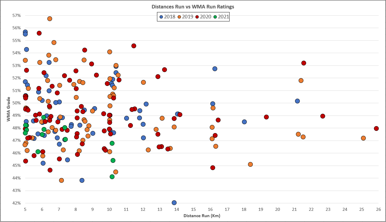
Above is a chart made with the same technique for a friend’s running record from 2018 to today. Now there are too many data points for data labels, so this would be much better visualised with a Power BI timeline slicer.