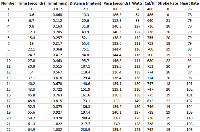
The Concept 2 ergometer (indoor rowing machine) has a performance monitor which will output CSV files of data relating to individual workouts. Pictured below is a small snapshot of the data contained within these files (I added the Time(mins) column).
The machine takes a reading once per rowing stroke and saves a record index value (Number), the number of seconds that have passed since the workout started, the distance rowed in metres, the time at the current rowing speed to complete 500m (Pace(seconds)), the power output of the rower, the calories per hour they are burning, the number of strokes per minute they are taking, and the rower’s heart rate.
Someone using the Concept 2 ergometer will take a stroke every ~2 to ~5 seconds typically, and there is one line record dumped to the CSV file every time.
Firstly I looked at heart rate. One of the two CSV files I had to visualise related to a one hour session of increasing effort. I calculated the maximum (90%+ of max heart rate), hard (80-90%), and aerobic effort (70-80%) thresholds for the 44 year old who supplied the data (max heart rate = 220 – 44), and used those to generate four columns of data to act as series for the chart below so that different colours could be used to visualised the zones.
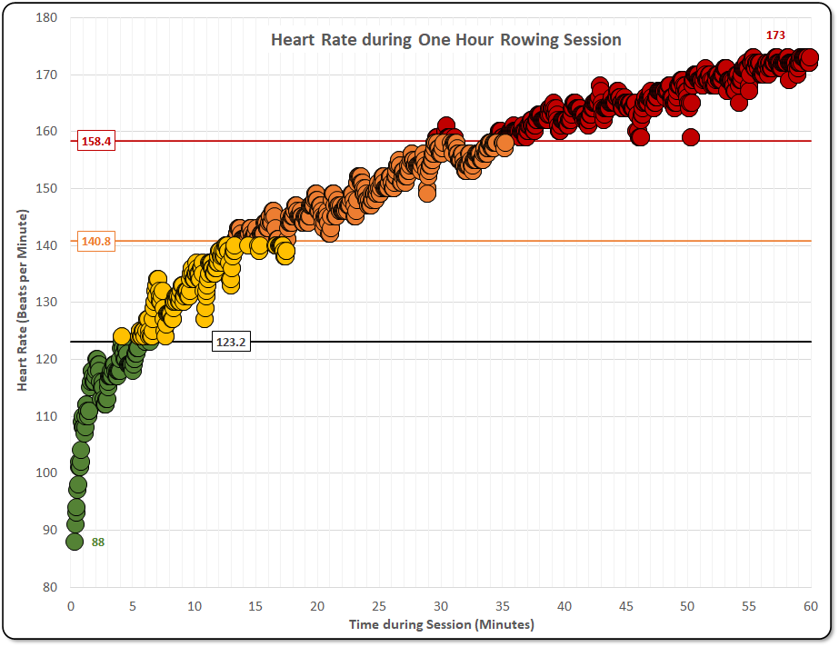
I also added data labels to show the minimum and maximum heart rates recorded during the workout, and labelled horizonal lines (additional chart series) to show the different heart rate thresholds on the chart.
Rowers work with 500m split times. The data does not show the exact time that 500m, then 1000m, then 1500m etc were completed, so those times had to be calculated. I used xlookups to find the nearest time and distance above and below each 500m interval, and interpolated between them to estimate the time at which each 500m interval was reached. This is visualised in the chart below.
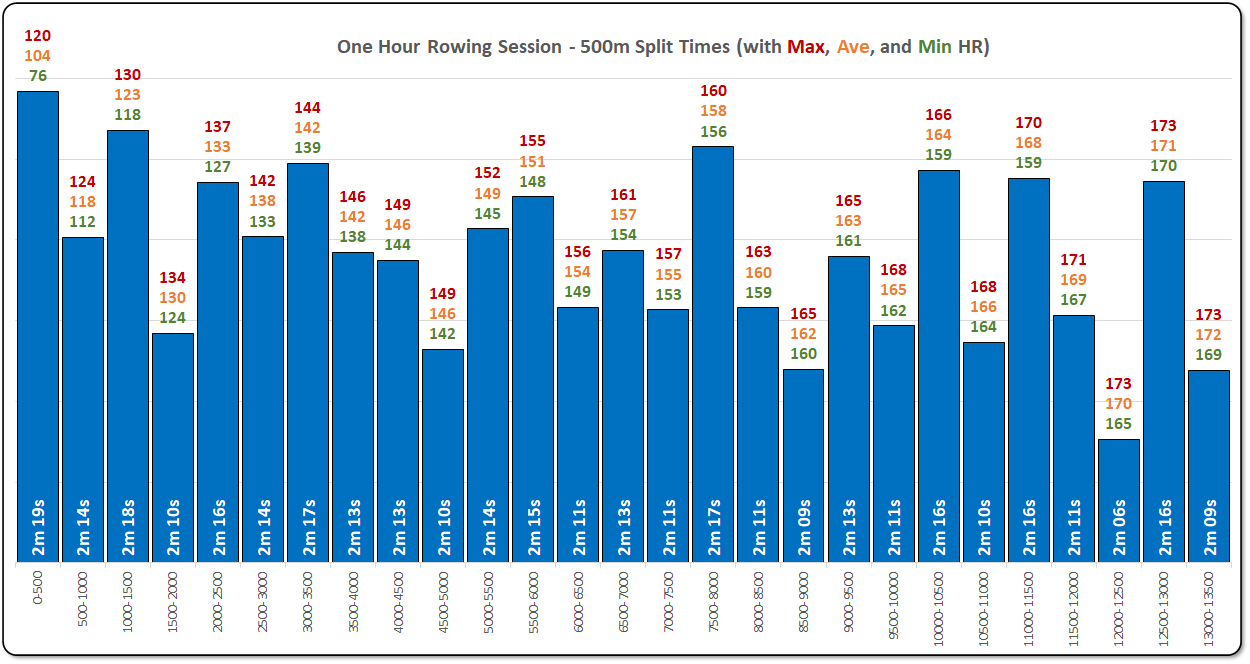
I used a stacked bar chart (with three additional but invisible (no fill) columns of data) to show the maximum, average, and minimum heart rate for the time duration of each 500m interval with multiple individually formatted data labels used for each bar on the chart.
The split times calculated were a bit suspicious with big jumps up and down in pace during a steadily increasing workout. This is probably because the line records in this dataset are separated by 3-4 seconds, and so a particular 500m interval could have 1 or 2 records more or less than its neighbouring intervals and therefore each 500m split time could be out by 6-8 seconds.
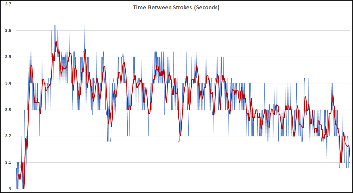
In order to better analyse the true pace of the rower, I made the chart below which shows the time in seconds between strokes (with some rolling averaging and smoothing for clarity)..
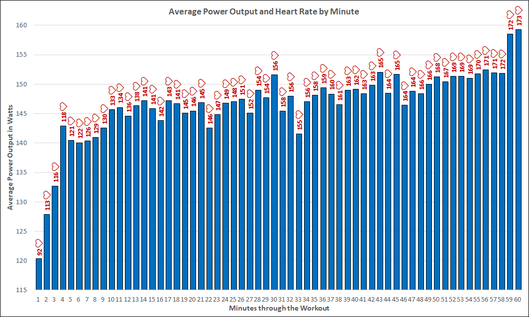
Finally, with the one hour dataset, I split the data into one minute intervals and plotted the average power output, but labelling each bar in the chart with the average heart rate measured during each minute.
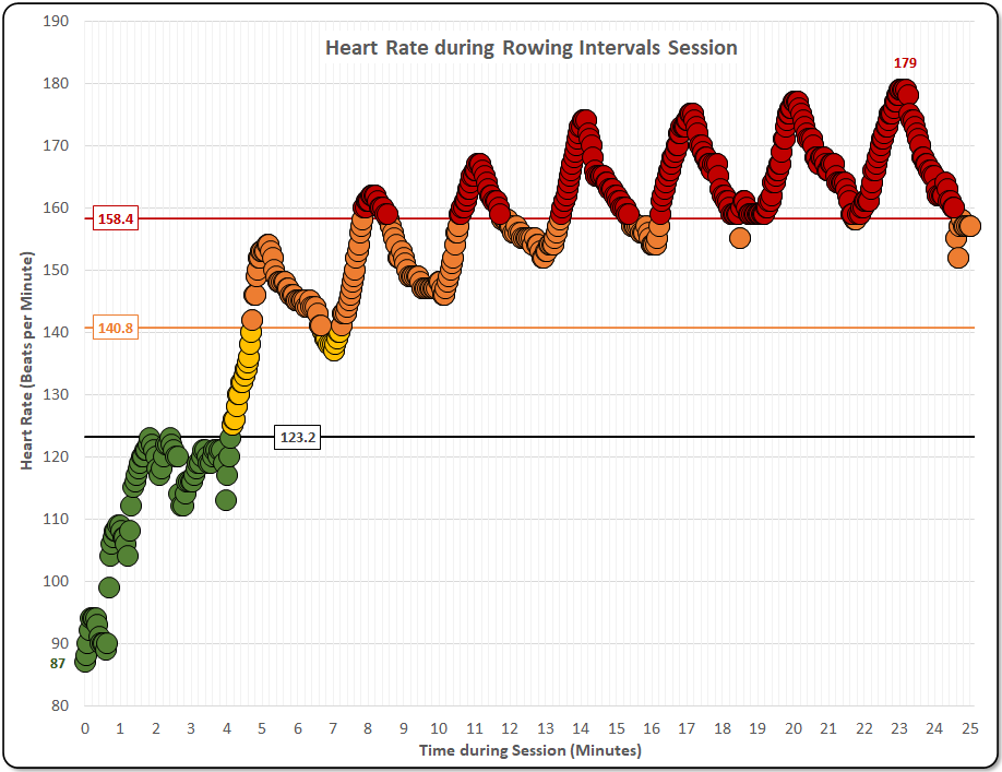
The second dataset of Concept 2 rowing data I had was a 25 minute intervals session….a warm up followed by seven repetitions of 2 minutes steady, 30 seconds at 24 strokes per minute, and 30 seconds at 28-30 strokes per minute. Below is a chart to show the heart rate during this activity.
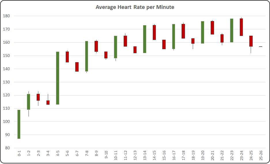
I also plotted the above data as a stock chart with one minute intervals (pictured below), but it does not show much information. I should have used 10 or 15 second time intervals to better show the increase and decrease in heart rate.
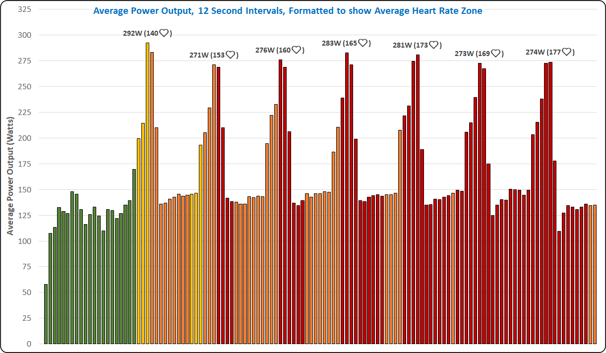
Finally I put heart rate and power output for the intervals session into one chart. The image below shows the average power output at 12 second (1/5 minute) intervals with the colours of the bars of the chart conditional upon the training zone of the average heart rate during each time interval. The power output peaks are automatically detected (in Excel, no VBA used), and are labelled with the peak power and corresponding heart rate.