I have collected my heart rate data for the last 7 months from my sports watch. In order to visualise trends, I have used Excel to bin the data in 5 beats per minute intervals. Below shows this data for the first five hours of sleep for each day.

Again in Excel I made the stacked column chart pictured below which shows the percentage of time during the first five hours of each night when my measured heart rate was within each of the ranges.

I then put the same data into Power BI to see if I could replicate the chart, and also to see if there were any benefits to doing with Power BI over Excel.

The finished chart was very similar to the Excel one, but it was a little bit more fiddly to set the colours of the columns for each series.
One advantage of Power BI however was that you can click on any of the range labels in the legend to view just that one range. For example, looking just at the 55-60 beats per minute range:
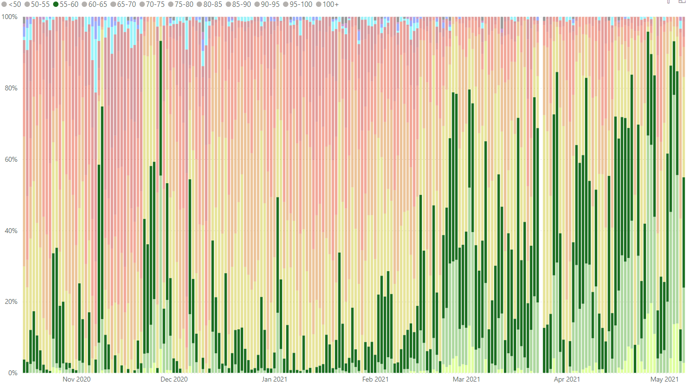
With Power BI it is also much easier to select which ranges to display on the chart simply by clicking to include or not different fields. For example, below show just the heart rates below 60 beats per minute during each night.
