I got the Strava data for a couple of my friend’s long runs: a city half marathon from May 2019 and a 16 mile training run (for the London Marathon) from early-March 2020 before the marathon was cancelled.
With Excel I tidied up the data and extracted the numerical data of interest. The chart below shows the time per kilometre pace for each of the 21km run as well as the elevation (green), 1h 55m pace (peachy pink?), and the average pace of the run (orange). The average heart rate (Garmin watch wrist measurement) is also shown for each kilometre split.

He managed 53:32 for the first 10k, and crossed the line with a chip time of 1:59:18. Calf cramps with the long uphill stretch from 16-18.5km in the last quarter of the race added a few minutes to the finishing time which could otherwise have been around 1h 55m continuing the consistent pace of the first three-quarters of the race.
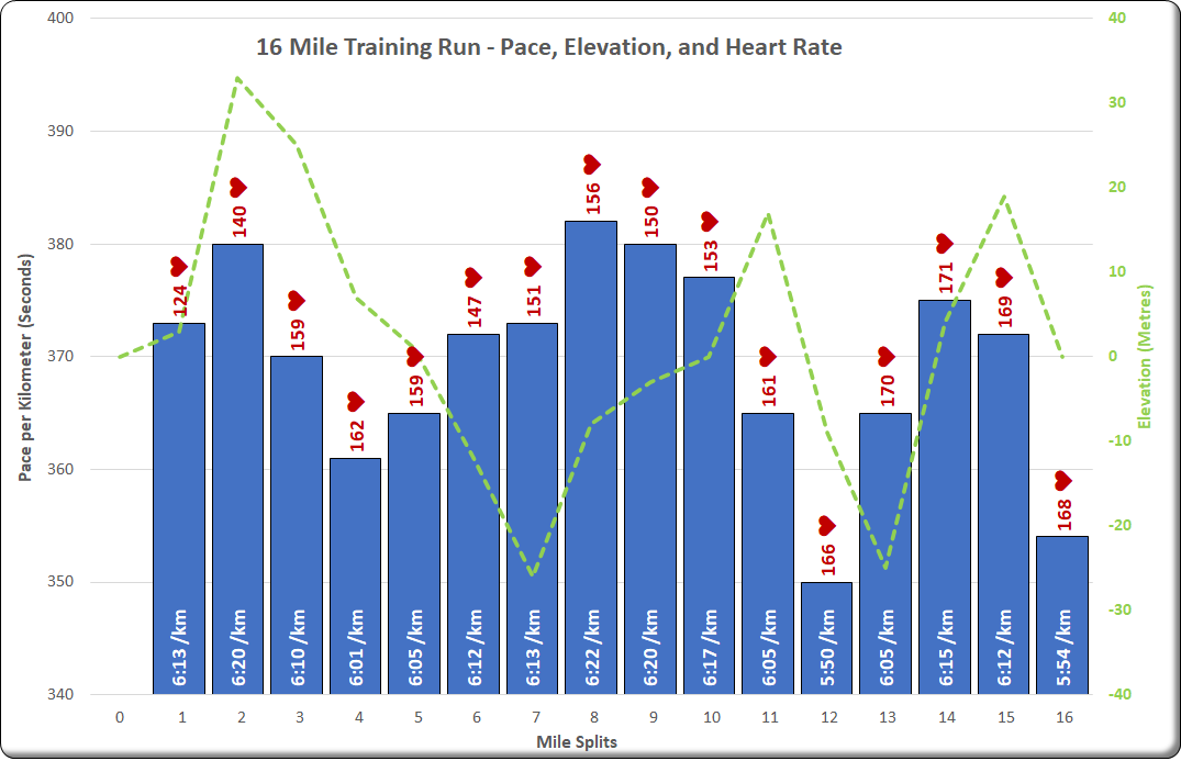
The similar chart below (this time with mile splits) shows his last long training run before the cancellation of the London Marathon in March 2020. He maintained an average heart rate of just 152 bpm for the half marathon distance with the pace affected only by elevation change indicating consistent controlled effort and finished the 16 miles in 2h 39m pushing a little harder for the last few mostly uphill miles.