Returning to Chess.com data (see here: http://www.neilmcniven.co.uk/3-conditional-formatting-of-bar-chart-colours-on-other-columns-of-data/), I had collected and saved all of my chess puzzle data from 29th Dec 2020 until 15th Jan 2021. Each day had its own CSV file looking like the one imaged below.

Each row gives the date, puzzle rating, number of moves correctly made out of the target number of moves, the score received by the player, and the player rating after that puzzle (along with some other columns of data that did not interest me).
I read these files into Excel as a folder and tidied the data up via Power Query Editor. Each CSV file was in reverse chronological order, so each had to be reversed, and the information I wanted had to be extracted from the strings using Split Column and/or custom columns built using M code. Finally some automatically detected data types had to be corrected.
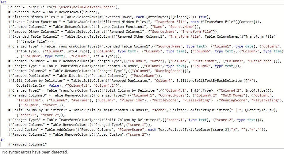
I should have done this pre-processing within Power BI, but instead read the generated table of data in from the Excel file I had made. (The processing steps would have been identical since Excel and Power BI both make use of Power Query Editor.)
I then carried on blundering around Power BI discovering and learning how to use different features of the app while trying to make some basic visualisations from the data. Click on any image below to view in full size.
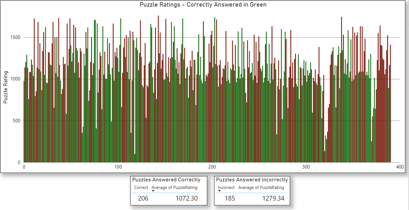
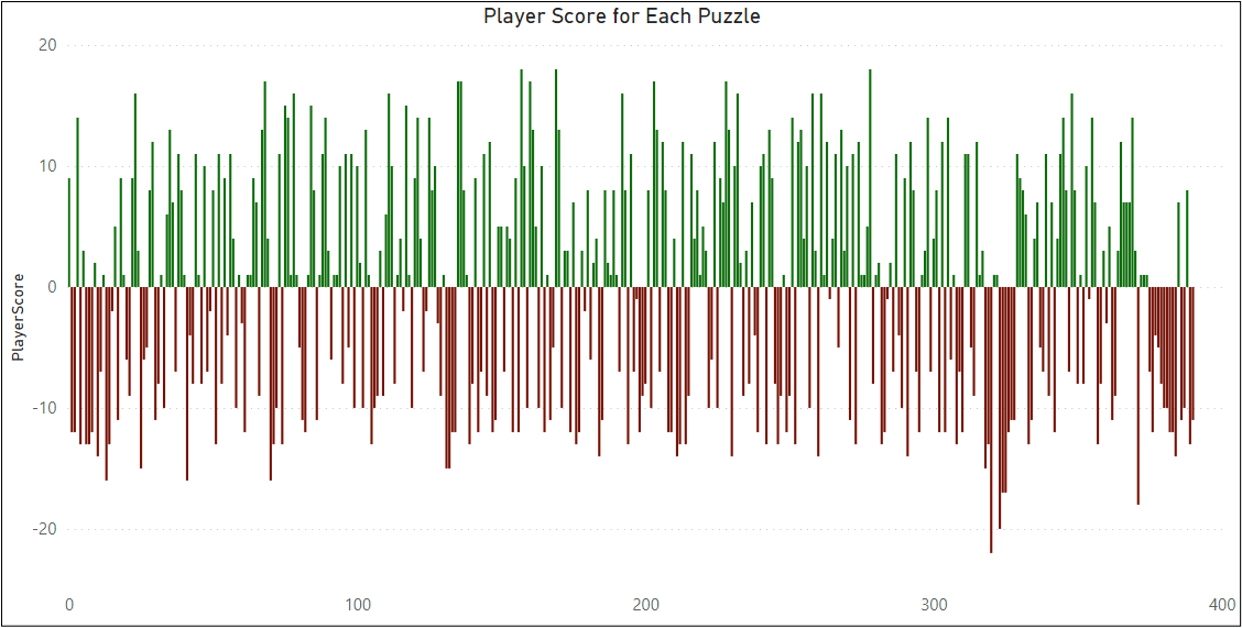

Power BI is definitely very powerful, but the user-experience is much less intuitive compared to Excel. Coming up with a visualisation idea and then trying to make it happen seems to be much more complicated, and often limited by what should be simple stumbling blocks to overcome.