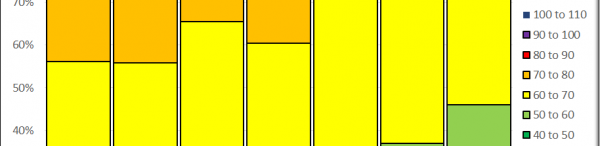
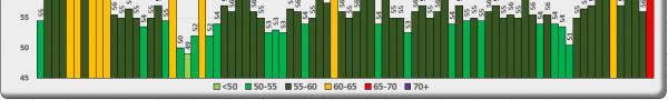
Category: Data Visualisation

4. Experiments Plotting Charts with Python – Google Cloud Platform

I have continued to experiment with Python to draw data charts, this time setting up Python (and Pandas, Numpy, SciPy, and Matplotlib) on Google Cloud Platform (https://cloud.google.com). Today (6th April 2021) I downloaded the latest official UK Coronavirus reported case data from https://coronavirus.data.gov.uk/details/cases and tried out some Matplotlib formatting and labelling.I made a column chart…

Read the full article

Premier League Football Teams During 2020-2021 Season – March 2021

The international break is the perfect time to take a look at the state of the Premier League and the form of the teams with more than three-quarters of the 2020-2021 season completed. All match results and fixtures are available here: https://fixturedownload.com/download/xlsx/epl-2020, downloadable in Excel format. This file gives the round number, match date, match…

Read the full article